Colours surround us no matter where we go or what we’re doing. One of the main reasons colours play such a big role is due to how every colour manages to affect us in a lot of ways—our moods, our first impressions and how we look at things. For instance, certain colours can soothe people; on the other hand, some can cause excitement or happiness. The effect can most clearly be seen among children because the kids are the most expressive and curious. This is why colours also play an important role in child education. With that, there is also colour psychology.
Since colours can affect even the youngest of minds, it’s no wonder that it’s so important for branding as well. Branding is not just what makes up your company or what values you hold. It is also how you present yourself to the eye of the public and how you want to be perceived by your targeted audiences. How you are perceived can in turn affect a lot of things like your sales, income, discoverability and so on.
Source: The Psychology of Colors in Online Marketing
The Psychology of Colours in Branding
It’s crucial to be mindful of the colours you choose for your brand. This is because certain colours can clash with each other and not complement each other. Colour psychology also plays a huge role in delivering the desired message to your audience. Having colours that complement each other is crucial, especially for applying them to your brand logo or overall visual identity. It’s also because different colours can give off different meanings and different impressions. Here’s a brief guide to the meanings behind some of the popular colours in branding:
-
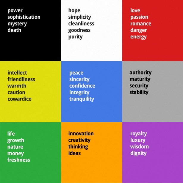
Red
Red is a very popular colour. Symbolizing great emotions like love and passion, red is a great colour choice if you’re going for something that is bold and eye-catching. It can also give off the impression that your brand is strong and fearless. On the flip side, however, red can mean danger, anger and aggression. So, with that, instead of avoiding the colour, try approaching your design and brand message in a more effective way. For instance, Coca-Cola uses red as their primary colour and it does not pose a problem for them because they are good at what they do.

-
Yellow
Yellow is globally known as a happier colour. This colour mostly symbolises optimism, creativity and intellect. One of the most recognisable examples we can give is smileys. You see a smiley emoji and it’s yellow. Most of the emojis on our phones are yellow, to symbolise the fun in them. However, in some cases, yellow can mean cautious or anxious. Nonetheless, a lot of brands succeed while using yellow as their primary colour. Take McDonald’s as an example. One of their main colours is yellow and they are one of the largest fast-food chains in the world. You could also take CR8 Consultancy as an example (wink wink). Our primary colour is yellow to symbolise optimism and creativity as per our name, CR8 (Create).

-
Blue
Blue is actually one of the most used colours in branding. This is because the colour represents trust and professionalism. It allows your brand to appear formal and dependable at the same time. Plus, blue reminds people of the sky or the ocean, thus it gives a soothing or calm feeling. Examples of big brands that use blue as one of their primary colours include Dell, Intel, Facebook and even Samsung.

-
Green
Green is a great colour for almost any brand. It represents growth, freshness, health and longevity. Different shades of green can also give off different impressions. As an example, darker green can give a wiser and more professional image and a lighter or softer green gives off a more youthful and fresh image. Some good examples of brands that mainly use green in their branding are Starbucks and Spotify!

-
Turquoise
Now, turquoise is a unique colour belonging to both the blue and green families. It can either be a turquoise closer to blue or a turquoise closer to green. Anyway, it’s a good colour to use for your brand if you’re going for bright colours. Turquoise can deliver meanings such as calmness, healing or self-expression. However, including turquoise in your branding can sometimes represent unreliability. Nonetheless, there are brands that pull off this colour without fail such as Canva and the one and only, Tiffany & Co.

-
Black
Black can be considered one of the sleekest colours one can use in their branding. It can convey sophistication, power and elegance. Though some might find it cold or dull, the colour black is used by a lot of globally-known brands. Those brands include Apple, Adidas, Hugo Boss and many more. Whether it be the base of their branding or simply the colour of their logo, there’s just something about the colour black that screams luxury and exclusivity. This in turn makes their brand and their products desirable.

What You Should Consider While Choosing Colours
Now that you know the meaning behind some of the most popular colours in branding, you should also know what goes into deciding what colours suit your brand:
-
Brand Identity
Your brand identity is everything. This is what makes up your company, your values, vision, mission, voice, personality and so on. Since your brand identity encompasses almost every aspect of the internal part of your company, it’s important to take it into account when you’re choosing your brand colours. Determine a few main keywords that help identify as well as describe your brand. From there, you can also choose a set of colours to represent those keywords best. While doing that, you should make sure that the colours complement each other and aim to elicit the right emotions from your targeted audience.
-
Competitor Analysis
Aside from knowing your brand identity, you can also research your competitors. This is to possibly figure out what can make you stand out from your competitors. For instance, you can research what makes your competitors desirable. Alongside that, you can find out how their target market feels about their brand through review pages and so on. On top of finding out how you can stand out, this can help know what mistakes you can avoid as well.

-
Cultural Significance
You might be wondering why cultural significance is something you should consider while choosing your brand colours. Well, when you’ve determined your target market, where they live, and what’s the majority race you’re targeting, certain colours have different meanings. For instance, the colour black in America can mean elegance and power. However, in countries like India and China, it can represent negative energy. It all boils down to who you want to attract and where you’re located.
-
Psychological Effects
What do you want your targeted audience to feel? What do you want the people in your company to feel? All of this should be considered when choosing colours for your brand so that your brand elicits the desired emotion. For instance, a kindergarten would almost never use the colour black because they are an institution for children and they want the children to feel happy and excited about school. On the other hand, you wouldn’t see a law firm use colours like hot pink or neon green because they want to appear professional and reliable to their clients.
CR8 Consultancy’s Past Works
All that’s left is for you to see a few good examples of the colours used in branding. Allow us to share with you some of the projects we’ve done for our clients that involved choosing colours for their branding:


 Conclusion
We hope you’ve gained something from this as we hope to have helped you with figuring out the colours you can use for branding, the colour psychology and what you have to consider before choosing those colours. Determining your brand colours can help tremendously in terms of making your brand look reliable, and consistent while getting your brand to be more recognisable.
Dizzy trying to choose the right colours for your brand? Leave it to us!
At CR8 Consultancy, we specialize in providing comprehensive branding services that include logo design and everything that is involved in doing so. Take the first step towards enhancing your brand by scheduling a free consultation with us today!