Modernising a Heritage Snack Brand for Today’s Market
Services
Rebranding
Packaging Design
Social Media
Company Profile
Marketing Collaterals Design
Info
Client: Snek Ku
Year: 2025
Industry: FMCG
Region: Malaysia
About
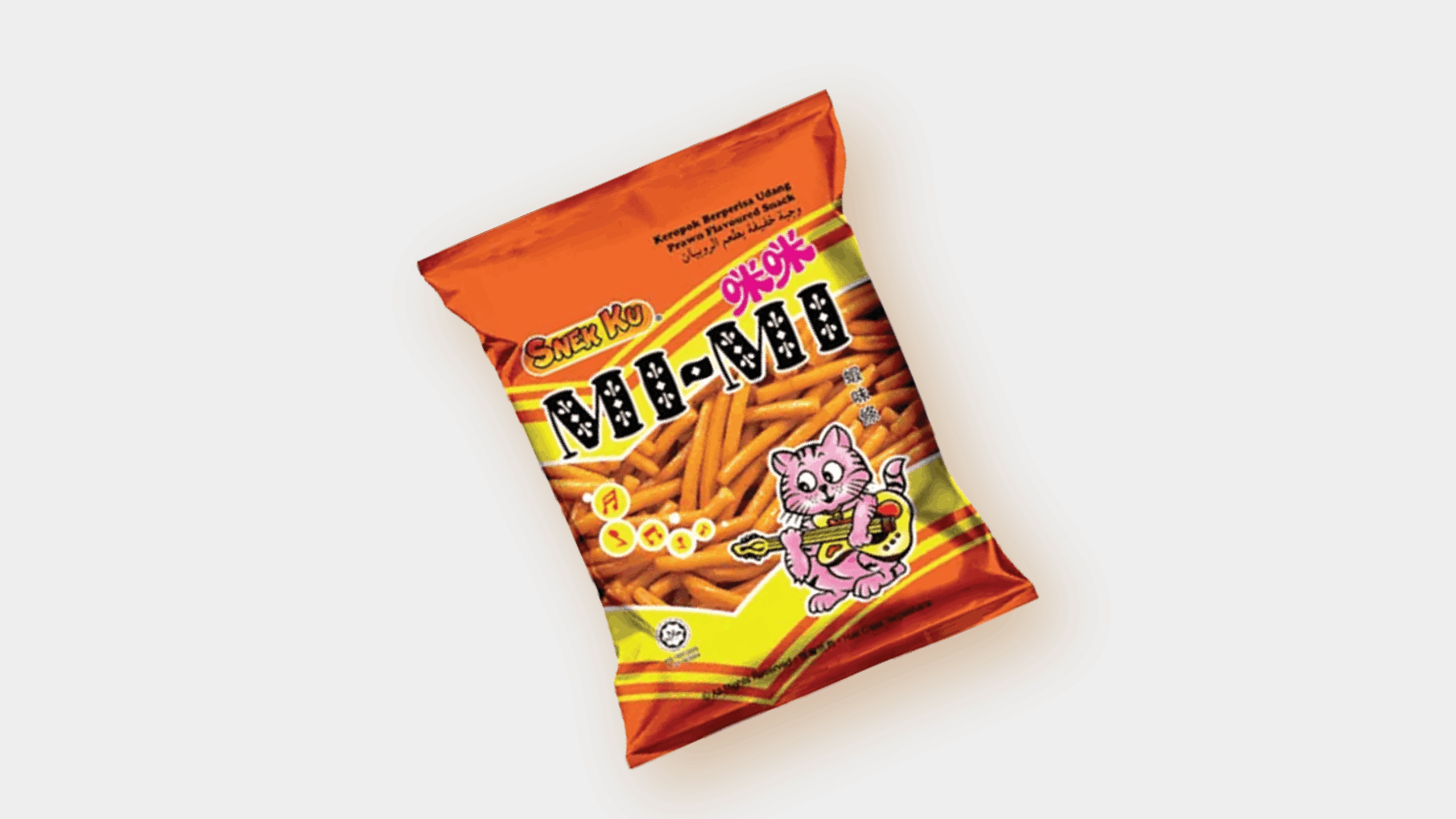
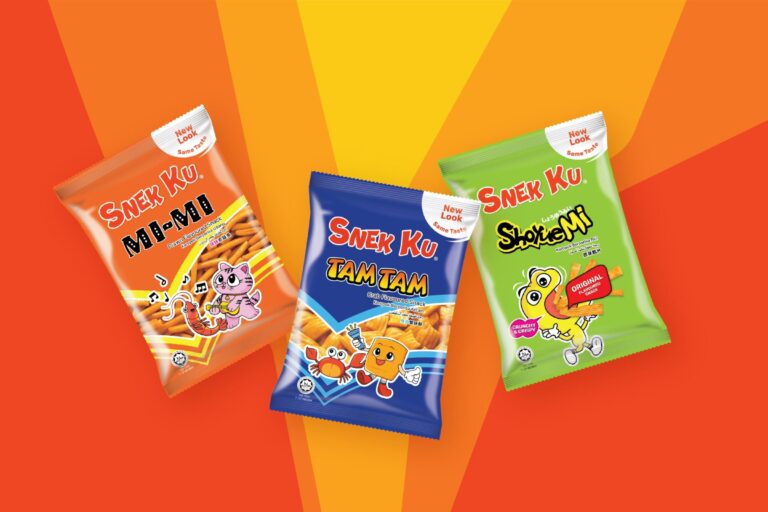
Snek Ku has been a familiar name in Malaysian households for generations, best known for iconic snacks like MiMi and TamTam. As the market evolved, the brand needed a refreshed identity that felt more current while preserving the recognition and nostalgia consumers had built over the years.
Challenge
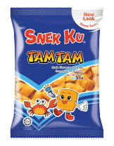
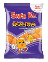
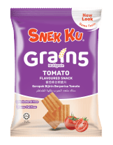
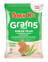
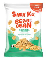
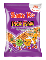
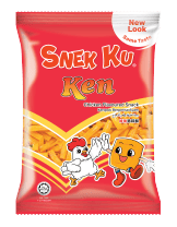
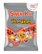
While products like MiMi and TamTam were widely recognised, many consumers didn’t associate them with the Snek Ku brand. At the same time, the packaging across different product ranges lacked consistency, making the portfolio feel disconnected. The challenge was to modernise the brand without losing its heritage, while creating a stronger, more unified identity across every touchpoint.
Solution
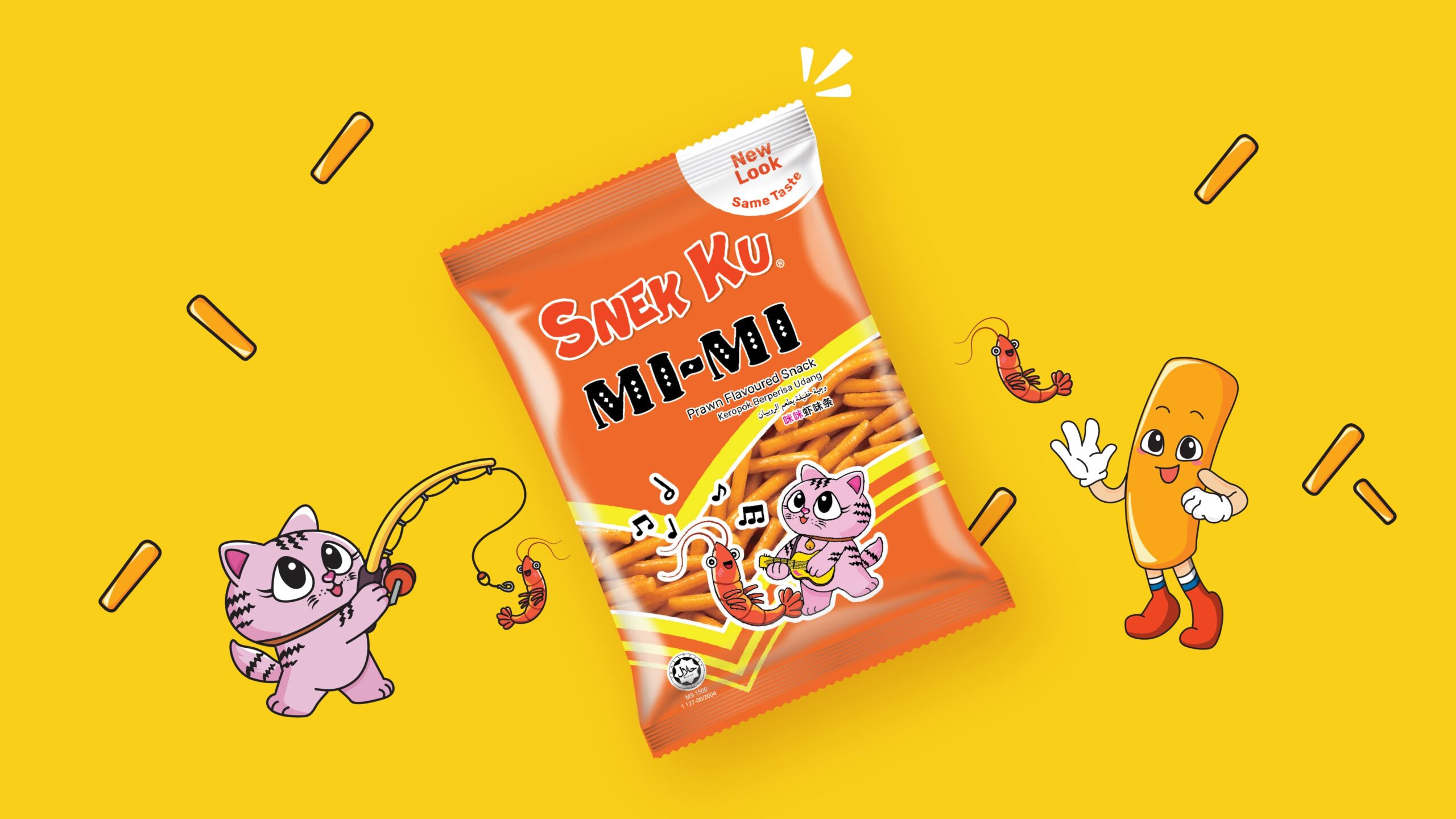
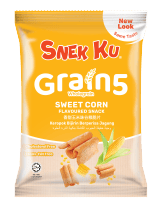
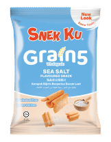
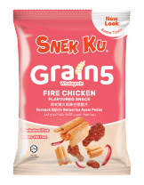
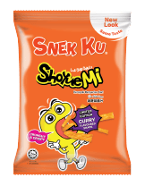
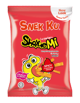
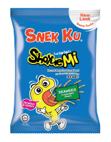
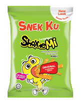
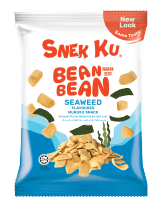
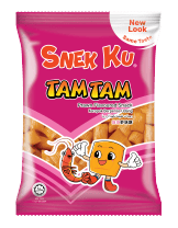
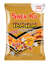
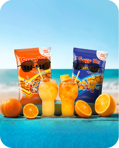
Strategic Rebrand: Modernised the brand identity while preserving the familiarity consumers know and trust.
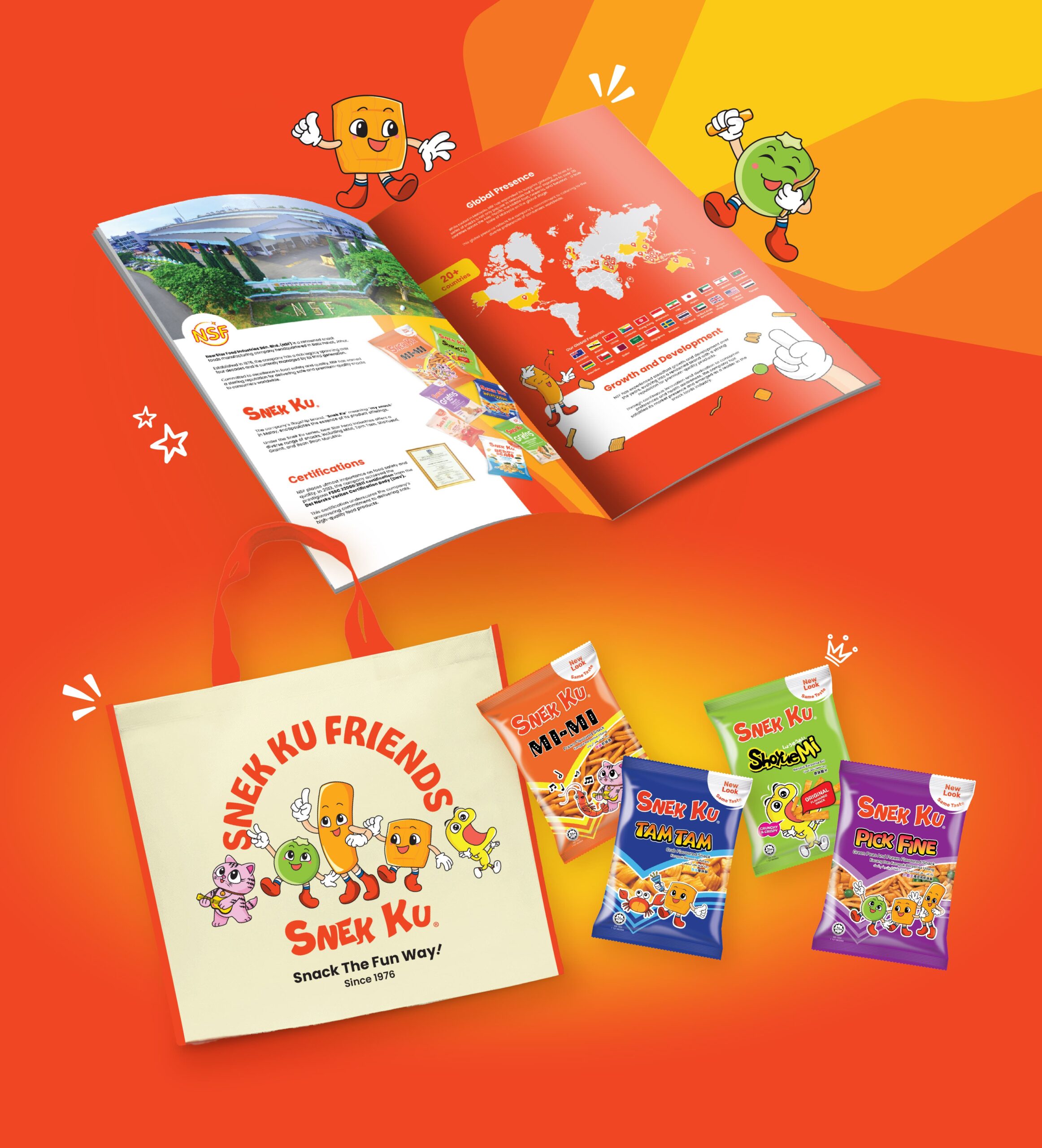
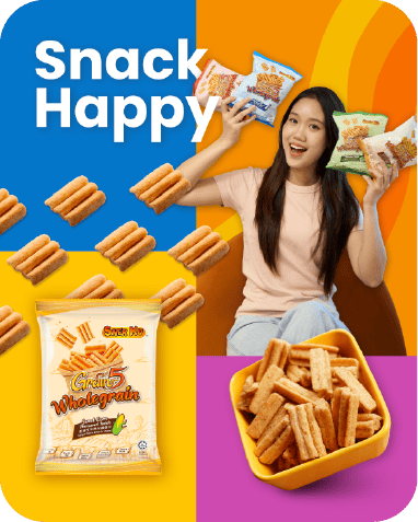
Brand Architecture & Packaging: Strengthened the Snek Ku master brand with a unified packaging system and clearer logo hierarchy.
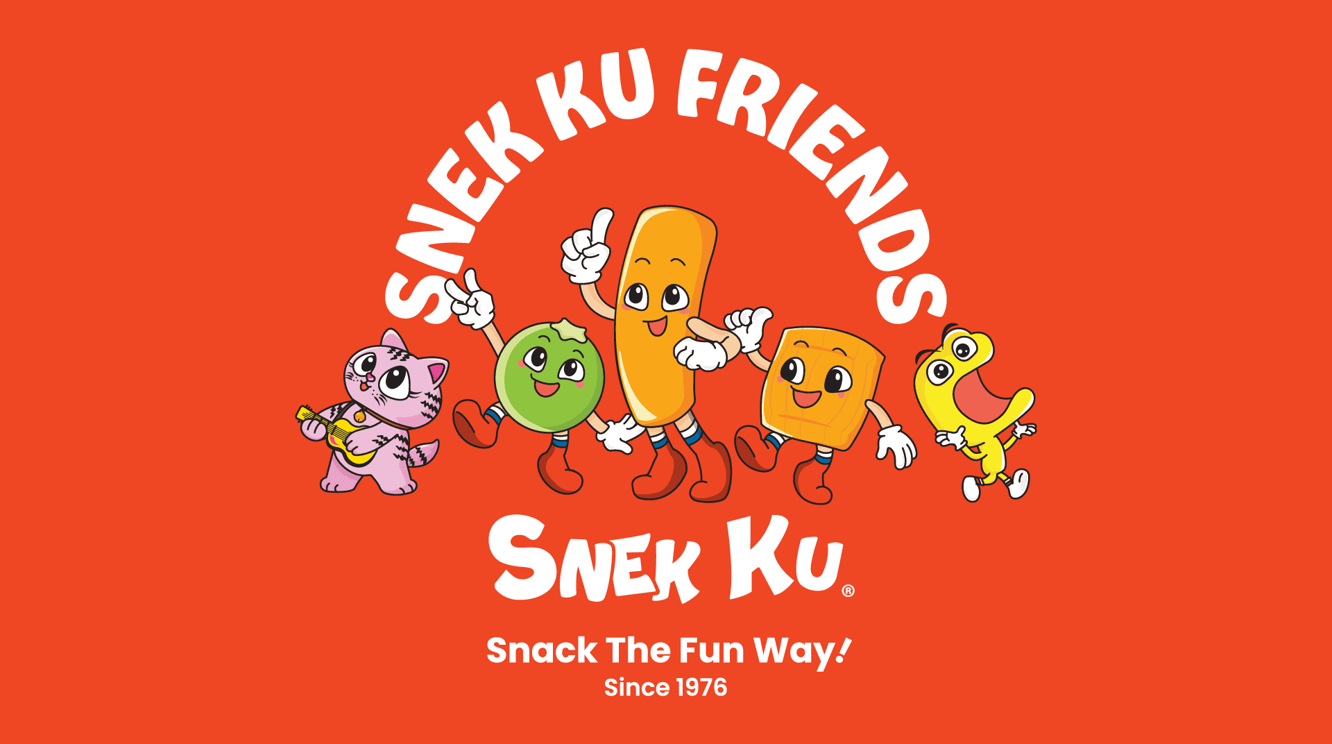
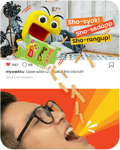
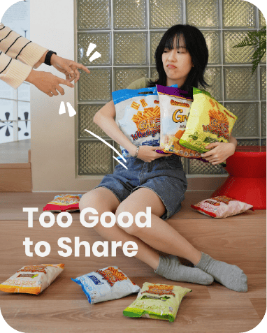
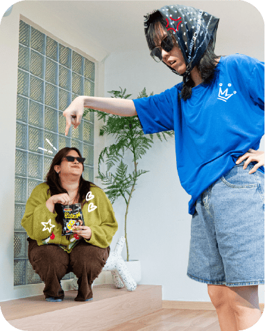
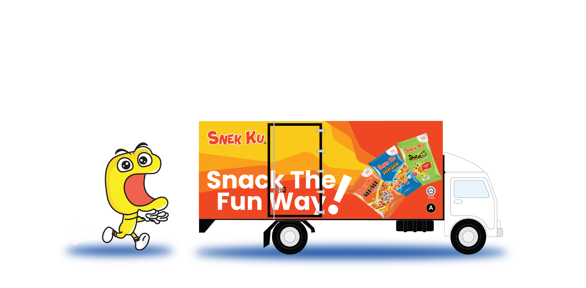
Social Media Direction: Refined the visual direction and content pillars to better reflect the “Snack the Fun Way” personality.
Brand Assets: Created brand guidelines, a company profile, and supporting collaterals for long-term consistency.
Jumped out into alook!